GHOST
Brand Identity
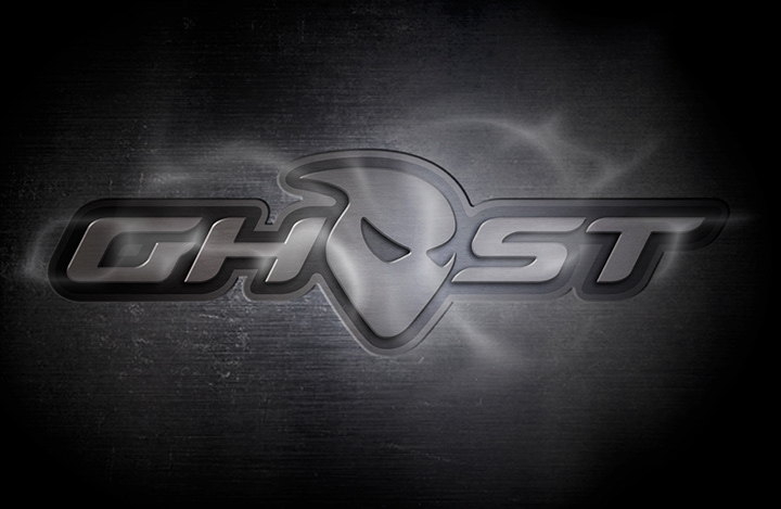
Brand Identity
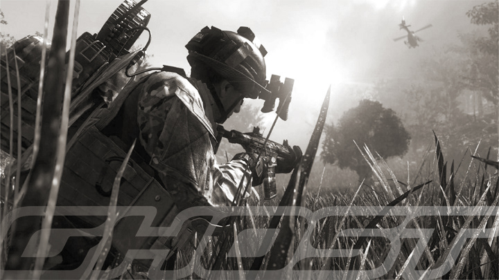
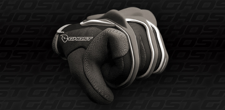
Ghost Elite Gaming Gear
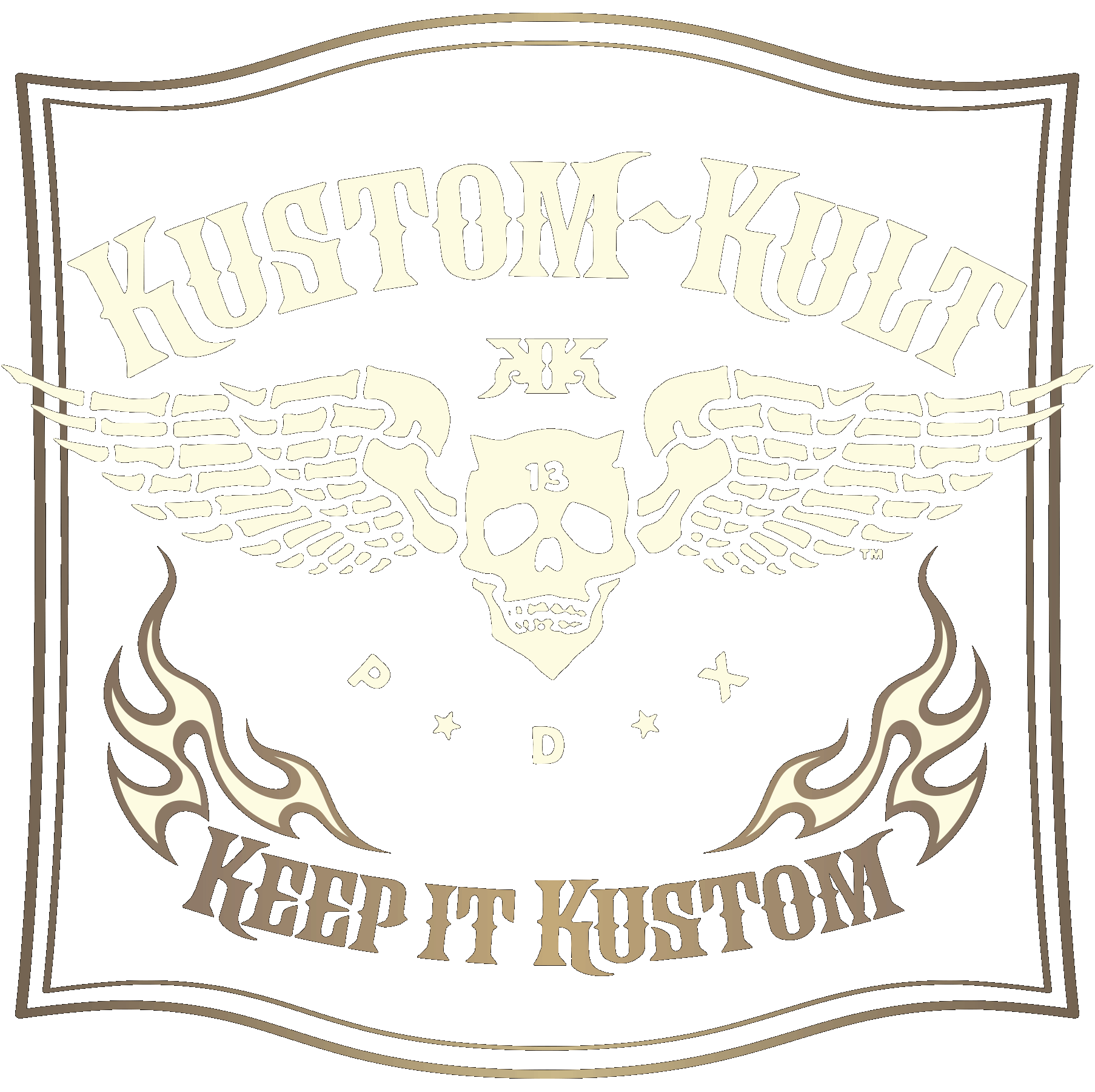
DAVE PARMLEY / KUSTOM KULT STUDIO
DAVE PARMLEY / KUSTOM KULT STUDIO
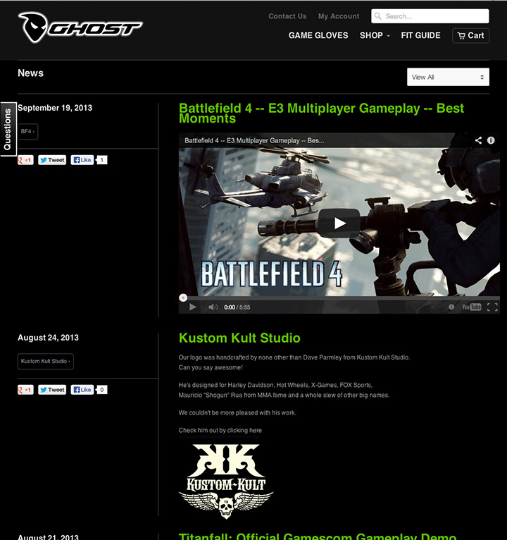
This Ghoul Got Game!
GHOST designs and creates premier high-performance video gaming gear for elite and pro-gamer lifestyles.
So I get a call from this cool guy James, who tells me he has a company named "GHOST" and would like to work with me to develop a brand identity. I almost lost it- a company named "GHOST" that had not already been trademarked by anyone? Wow! What an awesome name for a company, no matter what the product was!!! I was immediately intrigued and ready to jump on this project no matter what it was for. Then after the NDA signatures I found out it was for gaming gear- all the more reason to be stoked, being the gaming fiend that I am. C.O.D. being my time-suck, I was now ecstatic to team with James on this baby.
James, CGO of GHOST (guess what the "G" stands for) came to KUSTOM KULT STUDIO with a really cool concept for a logo for his new company, GHOST. He had been working on this himself, which, I must say, is some of the best "raw" art ever provided to me to work with. James had been working really hard create a brand identity on his own and just needed that extra insight from a seasoned logo designer to make the logo relevant for the multiple audiences he wanted to attract with GHOST.
Phantasmically Elite Gaming Gear
GHOST is about premium products, hence the audience for this brand expects a sophisticated and relevantly hip company vibe. James indicated that his desire for this logo to be "tech" as would be expected in the gaming industry, but to also hybrid the appeal with an upper tier "Action Sports" crossover.
GHOST is about premium products, hence the audience for this brand expects a sophisticated and relevantly hip company vibe. James indicated that his desire for this logo to be "tech" as would be expected in the gaming industry, but to also hybrid the appeal with an upper tier "Action Sports" crossover.
Working closely with James, we created a variety of logo interpretations & executions and he liked them all, so we developed them to work in all of the applications he needed, for GHOST Gear, print, web and across his line of apparel.
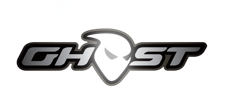
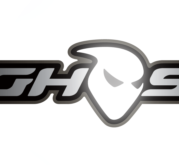
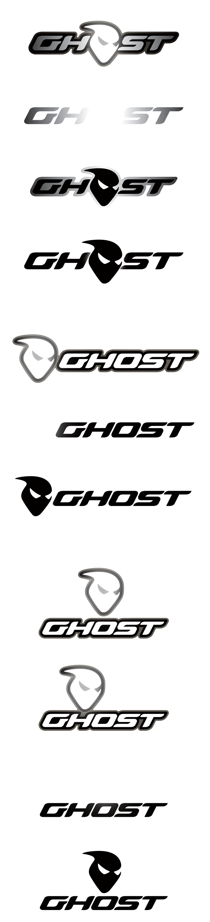
Logotype to Haunt The Feel Of The Ghost Icon
We had come up with some really interesting and cool "techy" type in the early rounds of development, but in context, they just weren't quite nailing the exact feel of directly relating to the style of the ghost head icon. Our goal was to have the logotype, in addition to working within a strong lockup, be able to stand boldly alone and still echo the same flavor of the ghost icon head. There was a weight and a flow in the icon that we worked hard to eminate in each letterform of the logotype. We also radiused all tips and edges in the design as a subtle hint toward a nebulous, apparition-esque kind of feel. We were stoked with the final result in the GHOST identity, as seen in the multiple executions of lockup options below.
Big shout out to James of GHOST and a big thanks for the opportunity to work with a cool dude and an awesome company! Looking forward to all of the free gear! Hahaha! No, seriously... : )
Additional Art Direction: James Rogers GHOST