

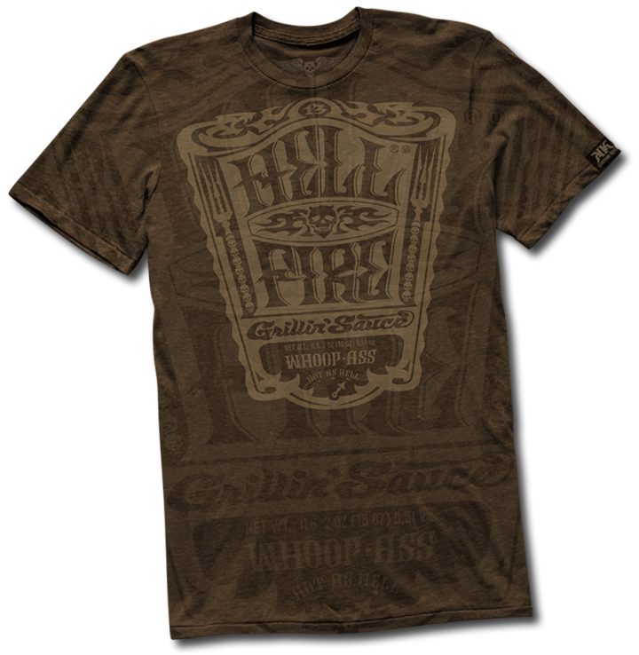
HELL FIRE Grillin' Sauce
Packaging
Collab with LIQUID Agency
KUSTOM KULT
ALFREDO MUCCINO / LIQUID
Wanna throw some gas on your grill??!!
This packaging collab started as a "what if" conversation with Alfredo Muccino at LIQUID agency while finishing up the last project together. Alfredo and I speculated on what the next project should be- and myself, a BBQ fiend, said I had yet to see a bottle of sauce that I'd wanna literally grab off the shelf. HELL FIRE was born out of a need for a Grillin’ Sauce that demands you give it a try, and, that lives up to it’s name. 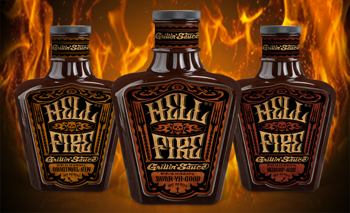
This sauce is NOT for wimps
The packaging had to hook you and pull you in, express the full experience of the thick, savory and brazen flavored sauce, and the choice of 3 levels of searing heat to set your buds ablaze.

Had to be tough enough
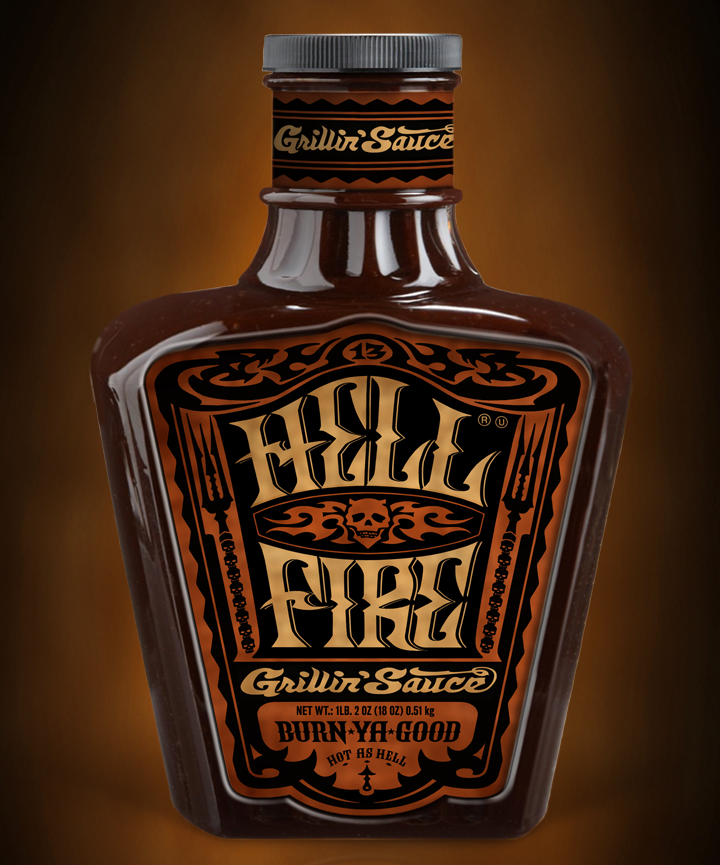
With a name like HELL FIRE, the Infernal regions of fire n’ brimstone were obvious, to us, as a source of inspiration for this product branding. We wanted to engage an audience that this whole vibe will resonate with. I’ve had the privilege to do a lot of work with HARLEY-DAVIDSON Black Label, and the feel of that world was a perfect fit for this product and packaging. The product name, the bottle shape and the graphics had to be “tough enough.” Research showed this particular look would be a relevant option to a broad audience within this food category and boldly differentiate from the bland-scape of bottles currently on the shelf.
Shake hands with El Diablo
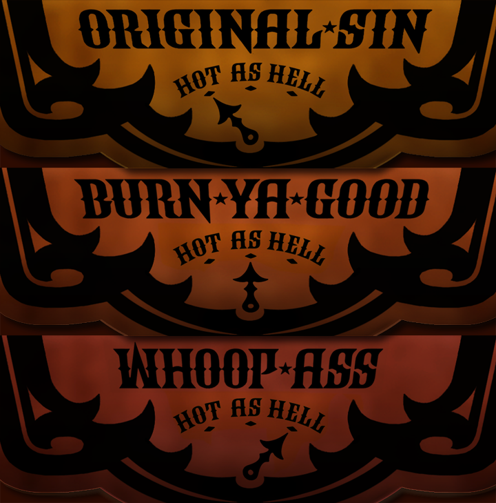
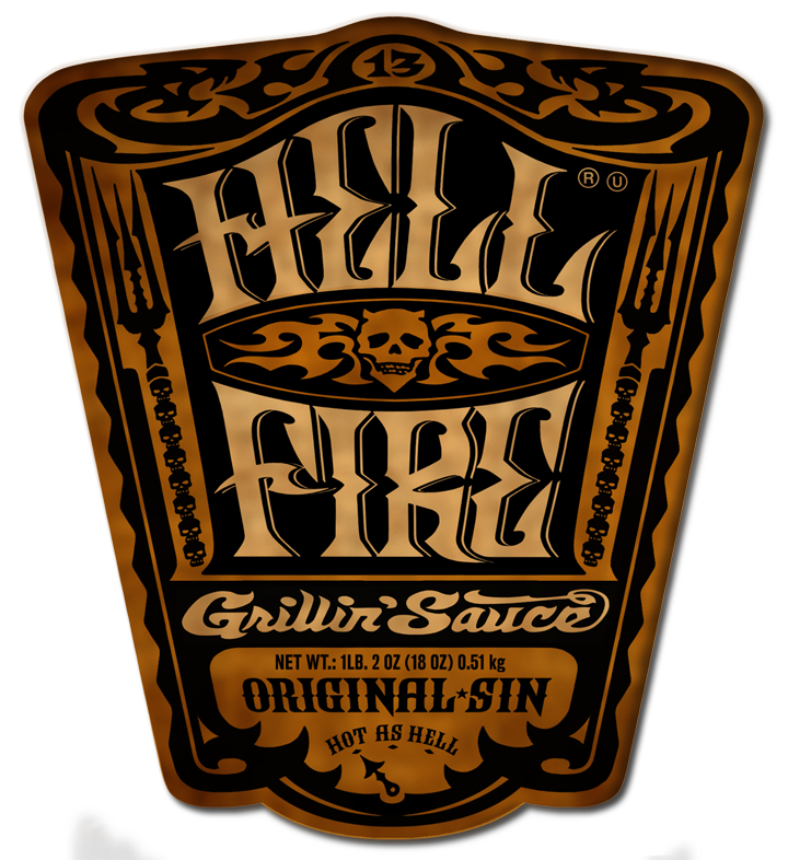
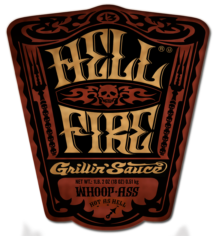
The bottle shape we designed had to be tough-guy good: squat & burly. The product name we created, HELL FIRE, had to spark interest, pardon the pun, especially at point of sale and be easily remembered.The sauce comes in 3 flavor temperatures, color coded to easily cue the customer from mildest (golden hue) to hotter (orange hue) to hottest (red hue.) The 3 levels of heat in the sauce options needed to have names that deliver; “ORIGINAL-SIN” for the mildest, “BURN-YA-GOOD” for medium pain, and “WHOOP-ASS” let’s you shake hands with El Diablo...
The Devil will own your soul– or your brand loyalty
The art flowed from the theme, and the product name was so strong we decided to give the name HELL FIRE primary real estate, and played down the more obvious devil imagery. Pitchforks made of lost souls and fire-belching serpents frame this sauce of damnation’s label like the gates to Hell itself. We wanted a sort of “Snake Oil” elixir, intriguing hip vintage to happen with this label. Something that draws you in and makes you say wut the- ? And then makes you laugh and say, “Hells-yeah I hafta give this a try!” And then, of course, the man with the horns and the devilish grin now owns your soul... or at least your brand loyalty!
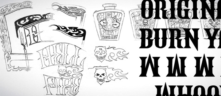
From sketches to final art, everything was “Kustom”
KUSTOM KULT'S process starts with hand-drawn sketches using pencil and paper, before anything gets into the computer. We tackled the project as a comprehensive assignment that included the bottle shape, product name and 3 "flavors," as well as the typography and the actual label design. All artwork is drawn by hand and all fonts are original & also crafted by hand- The “Kustom” in KUSTOM KULT.
As our clients have told us, there is so much value forged into product branding by hand-crafting graphics this way.
As our clients have told us, there is so much value forged into product branding by hand-crafting graphics this way.


Props To The Peeps
Dave was stoked on this collaboration with Alfredo and the good peeps at LIQUID, including Beryl Wang & Jameson Spence- thanks guys for all your help! KUSTOM KULT STUDIO looks forward to the next convergence of madness with Alfredo & LIQUID…
"Great work on this packaging, Dave. As my friends and family can certainly attest, I'm not great at BBQ-ing – but this packaging makes me want to get behind the grill and “shake hands with El Diablo himself”. Haha. As always, great working with you."
Alfredo Muccino
Chief Creative Officer
LIQUID
Chief Creative Officer
LIQUID

Sign Up For Our Email Newsletter!
Get The What's What From The Kult
You're all signed up- stoked and thanks!