
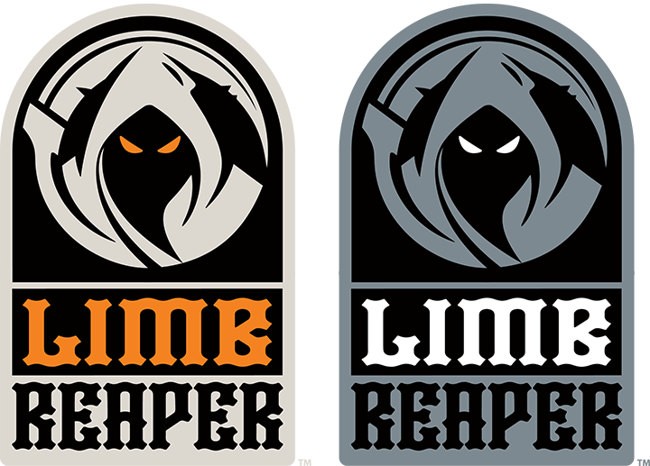
LIMB REAPER
Brand Identity
MMA + BJJ Logo Series
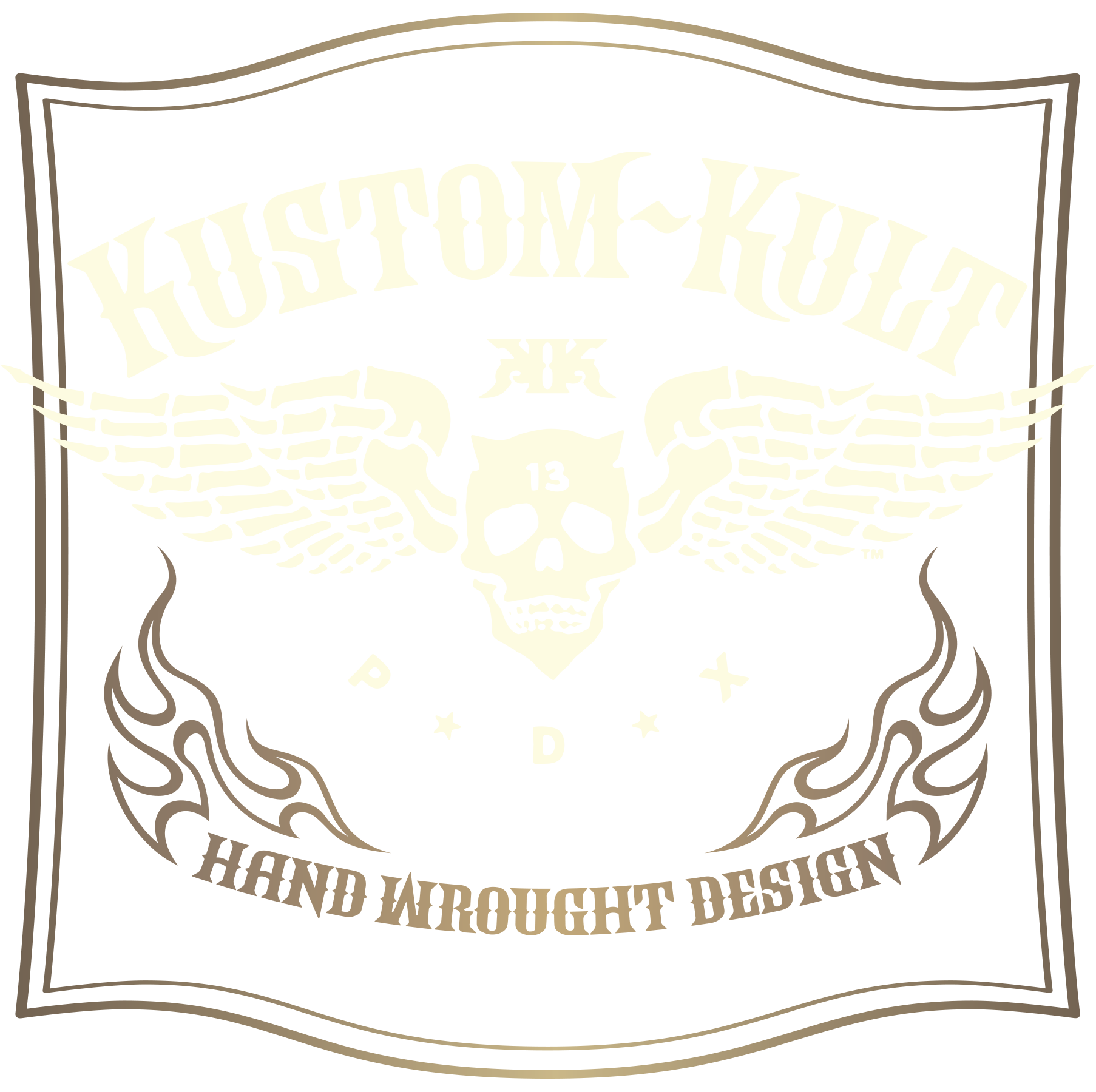
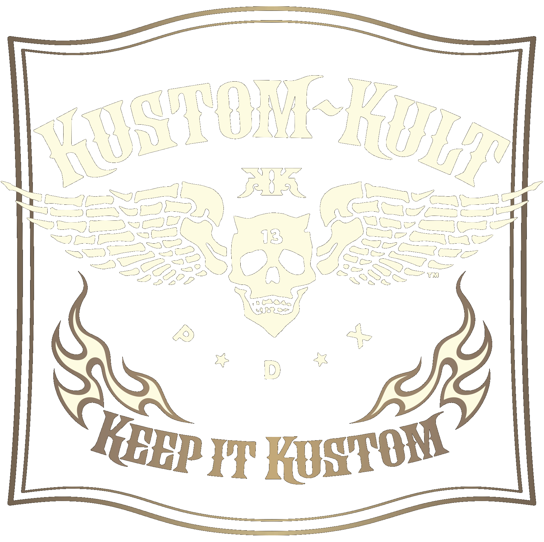
KUSTOM KULT
TRIGGER LAB STUDIO
You're Mine!
LIMB REAPER is a fresh line of MMA apparel and gear born out of a love for MMA, and a great sense of twisted humor. Beware, there is no tapping out– your limbs are about to be reaped! The Brand Mark Had To Live Up To The Cool Name
As a name to work with for an MMA brand, "LIMB REAPER" is so good for so many reasons! The Brand Mark had to live up to the name, so the pressure was on... The focus of the Brand Identity for Limb Reaper was to be clean and iconic, bold and strong. This would help separate LIMB REAPER as a brand from the multitude of logos currently within the MMA industry, many of which tend to be more illustrative in nature in the icon and/or the logotype design.
A Bone to Pick
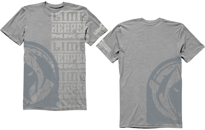
With a name like LIMB REAPER, we had to be all over a kustom BONE logotype. The name was immediately developed into a bone inspired letter-form, a play off of the "LIMB." The typography explorations were dialed into being more abstract and graphically clean for a bold read, both as recognizably bones and in legibility.We wanted this logotype to blaze on a walkout shirt- immediate brand recognition. The logotype had to be able to stand alone and lock up effectively to the Reaper icon.
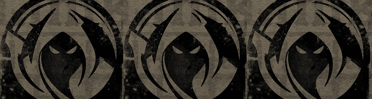
Locking Eyes With The Angel of Death
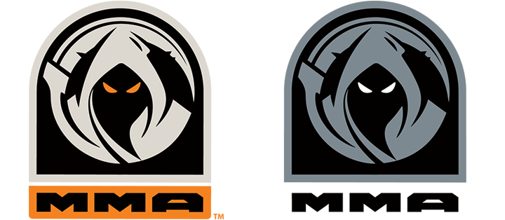
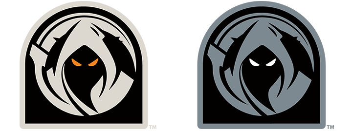
While working with LIMB REAPER, we discussed how we loved the idea of capturing the essence of the pre-match fighter "staredown." The parallel of the Reaper and the Athlete psych out was a beautiful thing to be able to utilize in the logo design.The objective in designing the Reaper was to capture the purest essence of the Angel of Death:
- The Hood with the mysterious darkness hiding beneath and the eyes, the eerily glowing eyes, forever in search of the next victim.
- The scythe would symbolize the reaping in REAPER, and we were so stoked when we realized the weird beauty of capturing the Reaper icon within the shape of a tombstone.
- We had earlier versions with a stylized skeletal hand gripping the handle of the scythe, but decided the simplicity without the hand was a more pure and powerful impact for the brand mark.
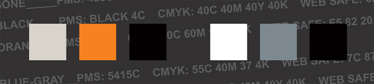
A Trick To The Branding Palette
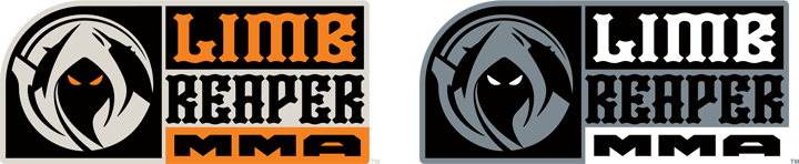
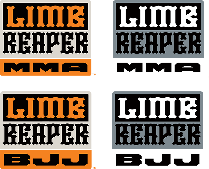
The corporate color palette evolved out of the founder's love of All Hallow's Eve, with the proverbial Bone, Orange and Black, the orange providing a potent color pop for the eyes and the MMA lockup in the logo.To play the logo statement down, the orange was removed leaving bone and black. In color explorations and field testing we found that the Cool-Gray, White and Black palette also resonated well with our audience as being mysterious and worked with a more understated appeal. Again, the pop color, white, could be removed to play the logo down as Blue-Gray and Black only.
o

o
o
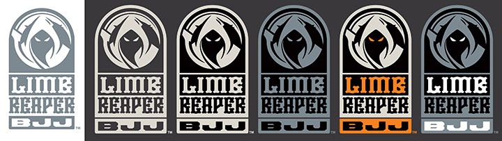
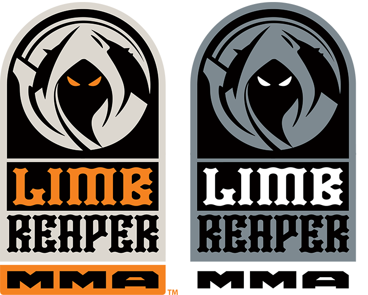
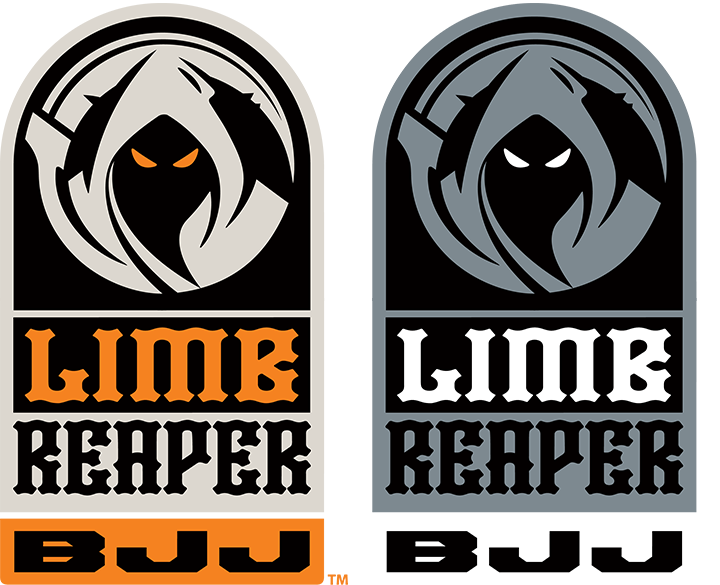
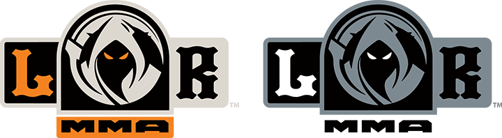
A Logo System For Every Need
We needed to create a working system of logo lockup options including the icon with the logotype, MMA, and BJJ. Each lockup was created with both an understated grouping and as a bold statement grouping, achieved in layout composition or by color, or both. This creates options, as the use demands, to offer a broad appeal to the full MMA audience.

o
o

o
o
o

o
o
MMA o


Sign Up For Our Email Newsletter!
Get The What's What From The Kult
You're all signed up- stoked and thanks!